
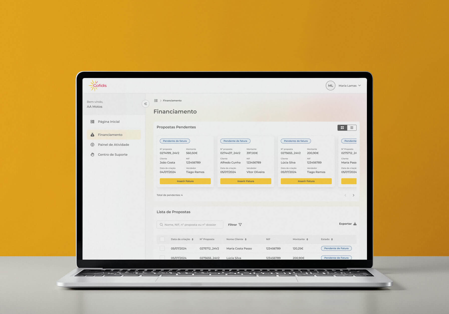
Cofidis is a financial institution specializing in the direct sale of credit to individuals and businesses. The B2B digital offering accounted for a large share of Cofidis’s profits, but its three products—each created, developed, and maintained independently—were not meeting customer needs.
As the B2B Design Lead, I began by conducting a heuristic analysis of each product and then organized a workshop with a few elements of the product teams and the B2B Business Director. With the goal of getting to know the teams better and fostering a sense of involvement and participation in improving the products, the main activity involved having them identify as many usability issues as they could.
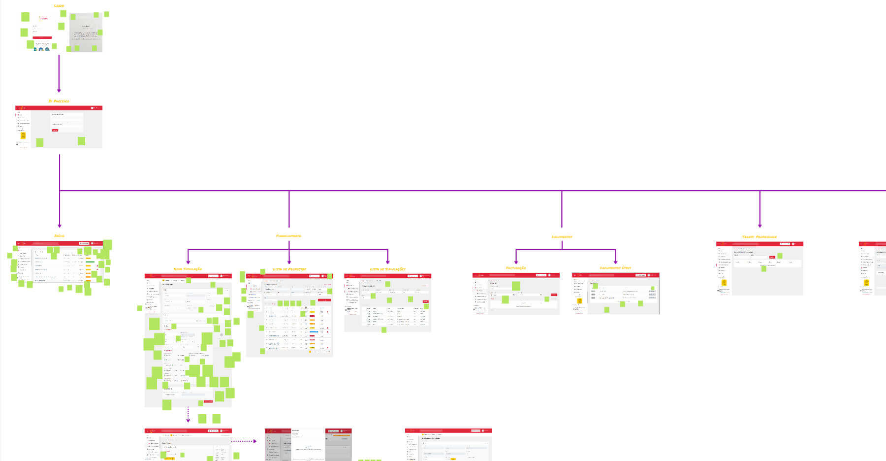
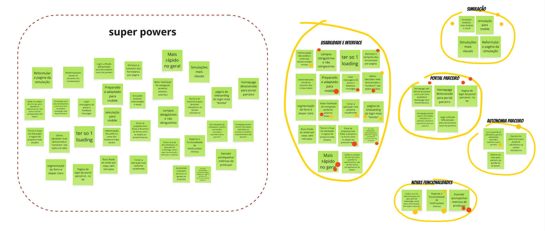
The next step was to gain an understanding of the business objectives and learn about the B2B customer journey at Cofidis — hereinafter referred to as “Partner”. I conducted a few interviews with Partners to gain a better understanding of their challenges and needs.
The main problem then became clear:
There are four platforms, each with different login credentials, interaction methods, and visual designs. The partner must know which product to use and at what stage of their relationship with Cofidis, as well as how each one works.
In addition, managing the partner’s relationship with Cofidis involves a significant commercial burden, as well as the effort required to deliver performance reports that give the partner visibility into their productivity. Maintaining products with different technologies was also identified as a pain point by stakeholders.
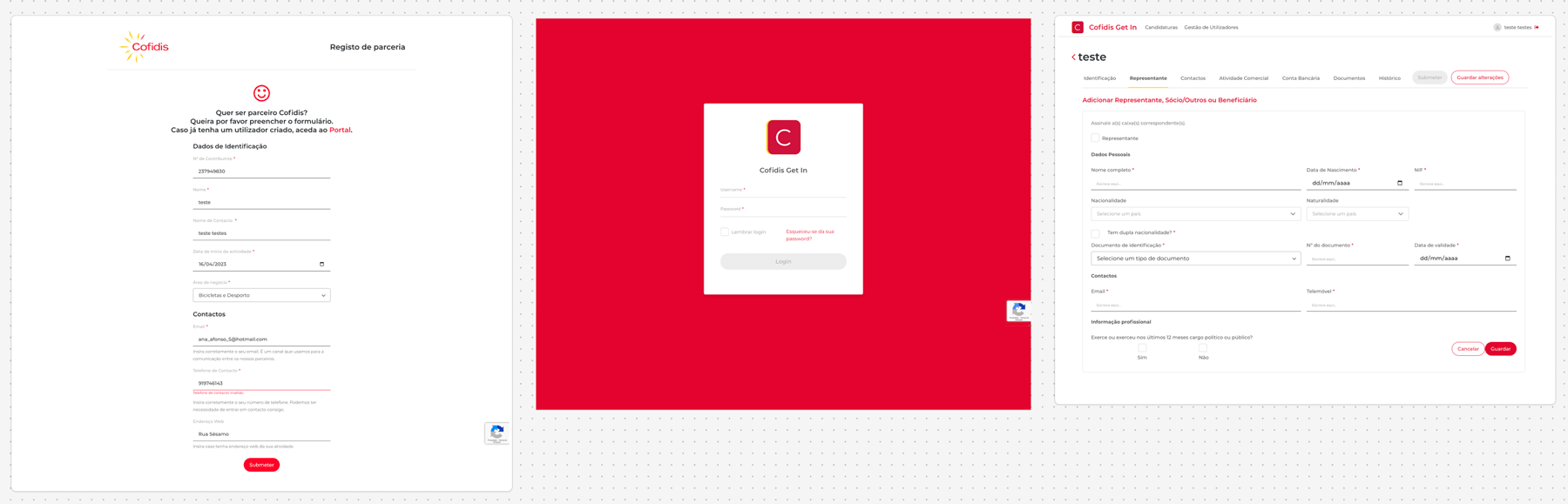
Get in - platform created for the company's application to become a Cofidis partner
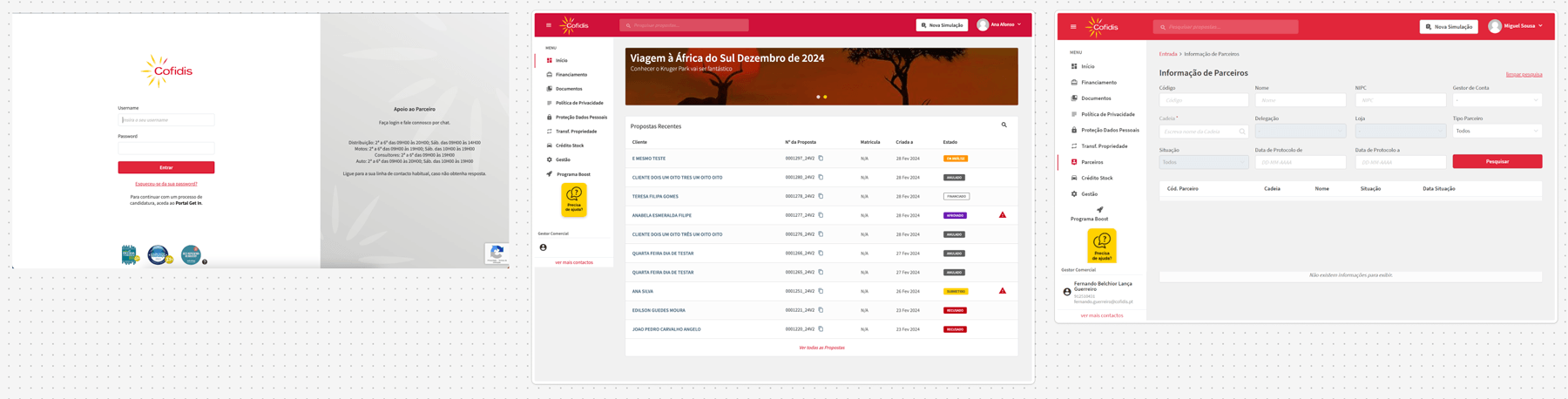
Webpac - a partnership management platform where partners, among other things, submit financing proposals for their customers
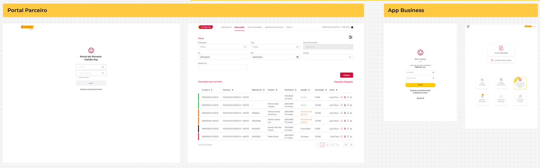
CofidisPay - consisting of the Partner Portal, a management website, and the Business App, for processing installment payment proposals for purchases
I organized and facilitated a design sprint with various stakeholders (from the CTO to the sales team) in order to gauge their perspectives and gather input from the various participants, ranging from business to analytics.
THE CHALLENGE
It was determined that the B2B digital offering had the following requirements:
LONG TERM GOAL
The single point of access to the B2B multiplatform is a solution for all Cofidis partners that provides a 360° view and monitoring of their business in an efficient, simple, and intuitive way.
Throughout their integrated journey, partners can access all the services and offers tailored to their profile.
By providing a better experience for its partners, Cofidis is the obvious choice for consumers.
This Design Sprint resulted in a prototype that we would use as a proof of concept with five Cofidis Partners.
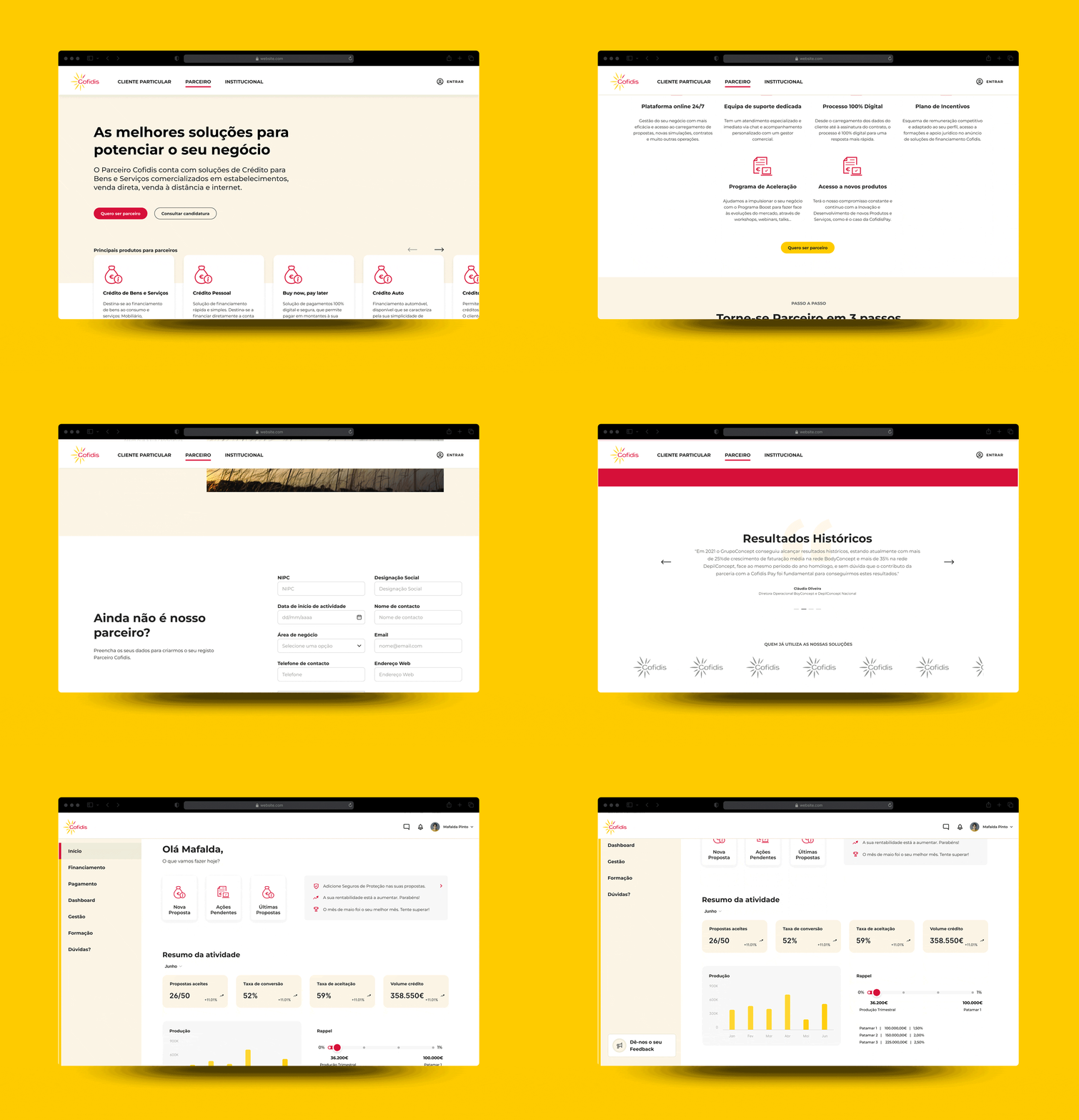
The feedback was very positive, and with the stakeholders on board, it was time to move on to the research phase to inform our approaches and decisions.
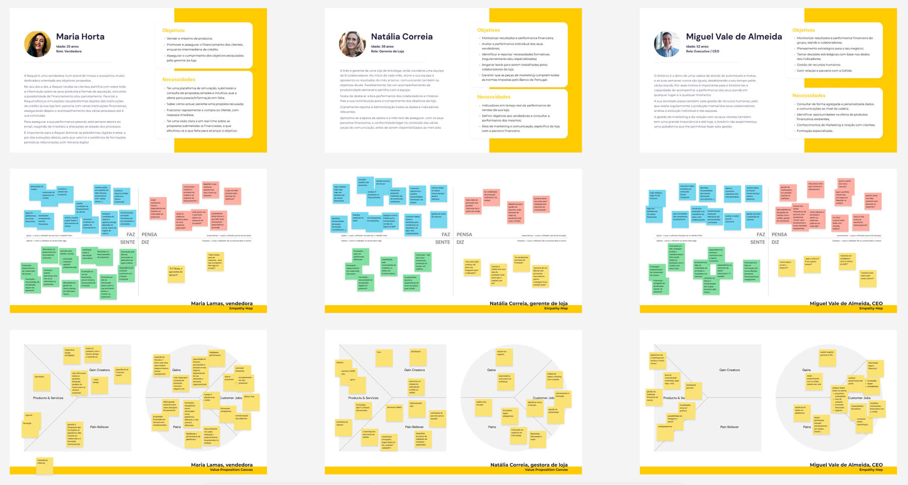
I conducted a benchmark analysis and created personas. This was followed by a new, one-day workshop, where we created empathy maps and value proposition canvases for each persona and concluded with visual proposals for what the new Área Parceiro could look like.
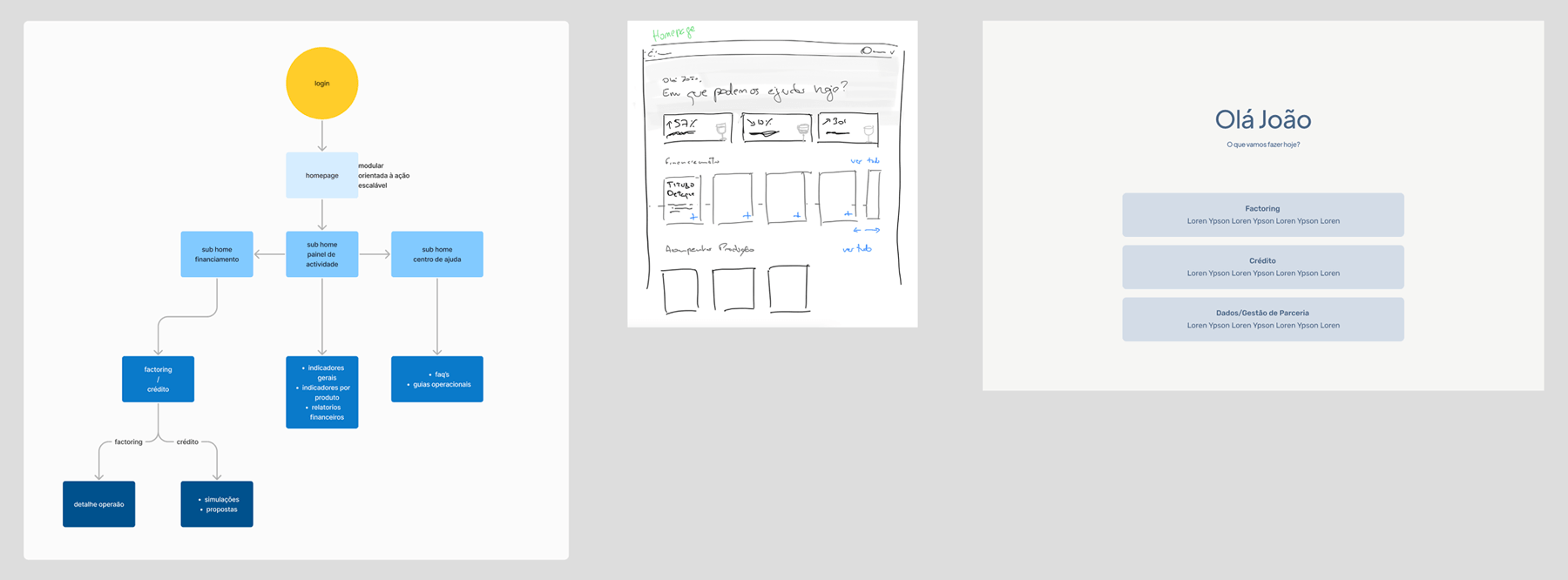
While we were looking for a designer to expand the team, I drew up a sitemap and created wireframes to align with the B2B director’s vision for the features of this new Partner Area. I then put together a roadmap for the design team’s MVP, to be discussed with the product manager.
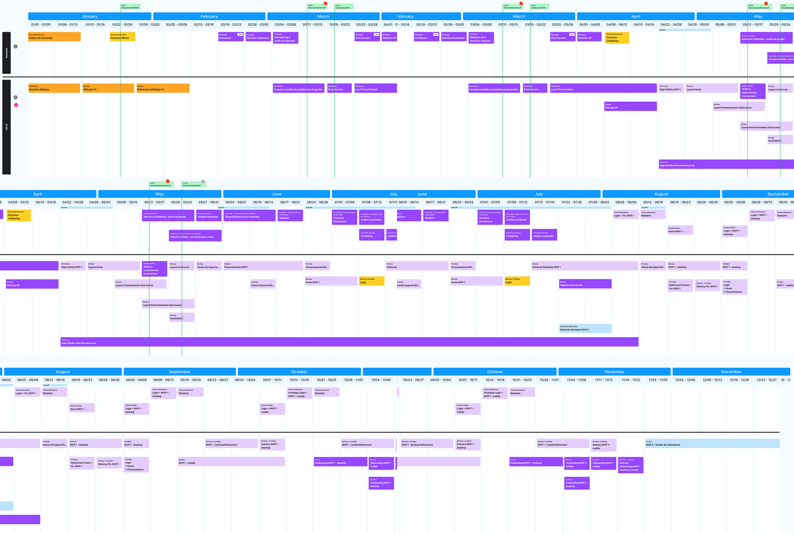
At the same time, I was co-responsible, along with Bernardo Pimentel (B2C Designer), for the Cofidis Design System. Initially, we focused on supplier management, and later we became actively involved in creating and documenting the components identified as fundamental to the Cofidis product ecosystem.
After conducting surveys and interviews with Partners and we went through some design critiques with the design team. We then performed usability tests on every new feature we designed.
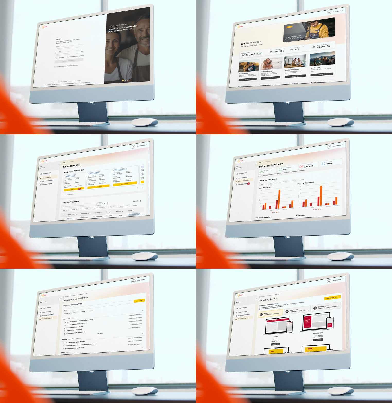
And so Área Parceiro was born—a platform for business development and partnership management with Cofidis, featuring a single sign-on and content tailored to the Partner’s specific needs.
MyLADS, a recent startup selling sports collectibles enriched with augmented reality, hired me to help them improve their digital products.
After LADS, there was a new product to be launched: MyJersey. MyJersey is a vinyl sports collection with associated Augmented Reality (AR) technology and accessible through the MyLADS mobile app. It is designed for fans and collectors, official and detailed mementos that will allow anyone to relive a particular era or competition and share it with future generations.
But first of all: who is MyLads? What do we stand for? What do we offer, and to whom? What do we want to achieve? As if the questions weren't enough already, we had to change our name, so it would be more inclusive. To get some answers, I ran a workshop with MyLads workers:
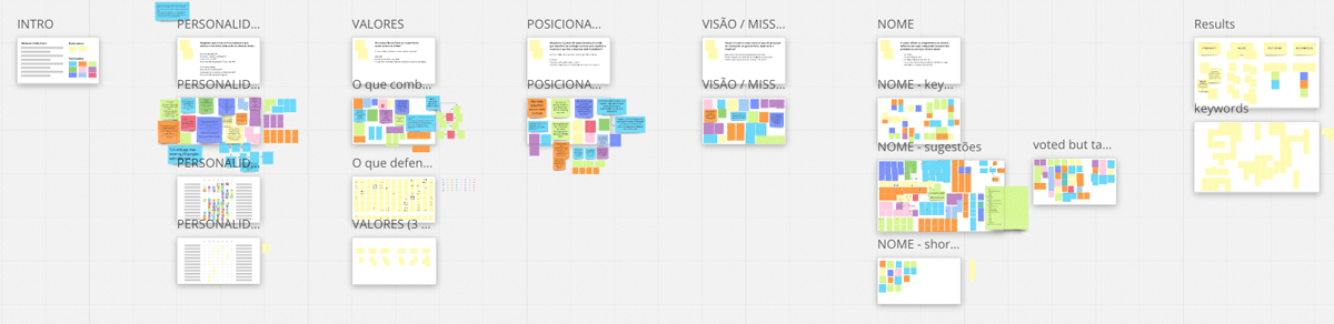
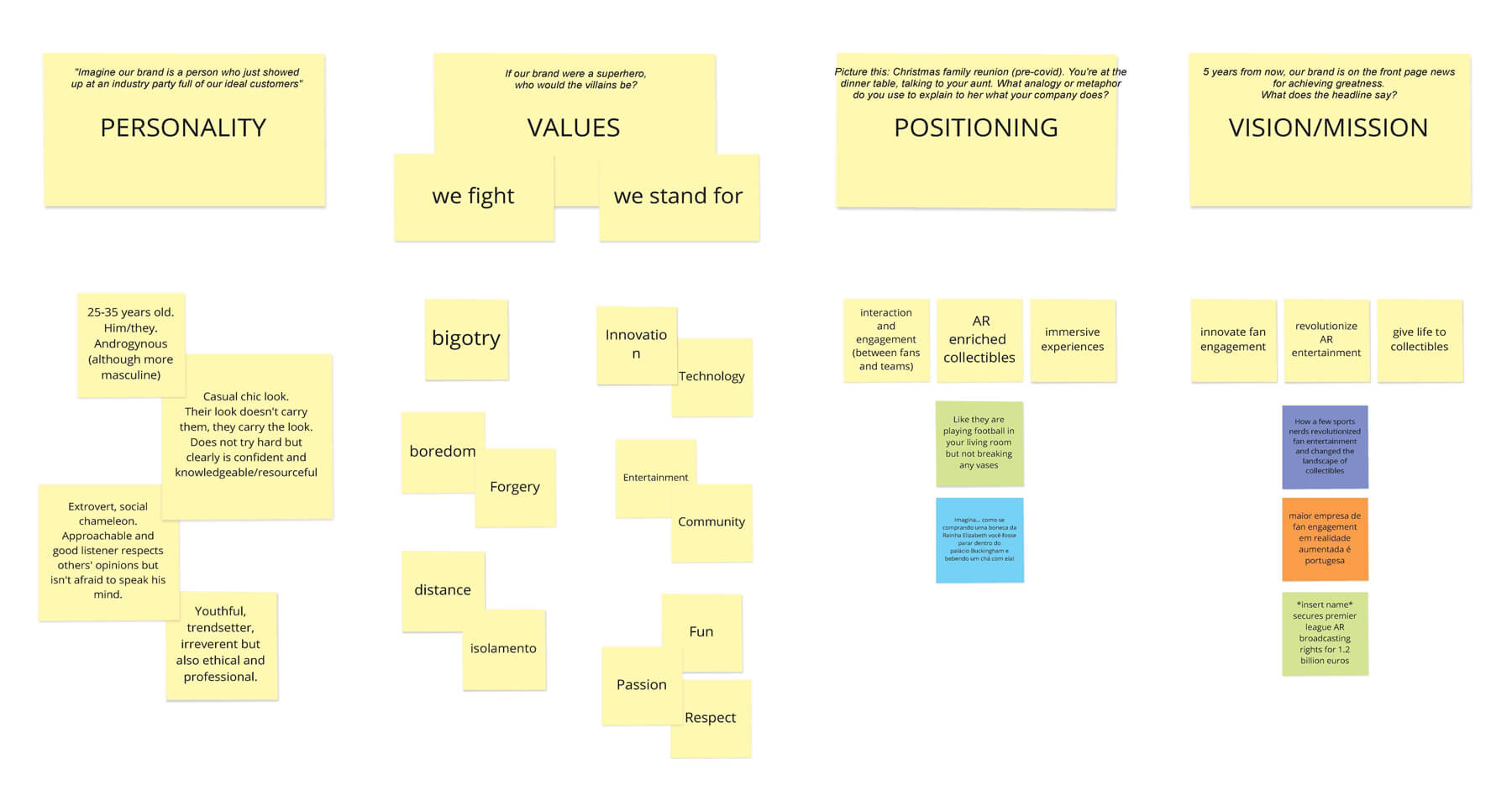
Now that we know who we are and where we want to be, I shared the workshop findings with an external agency to work on the brand.
During the branding process management, I created 2 surveys, one for customers and one for the general public. This allowed me to learn more about the MyLADS customer, their frustrations and desires and also to get feedback on the features of the new products. The next step was the creation of personas.
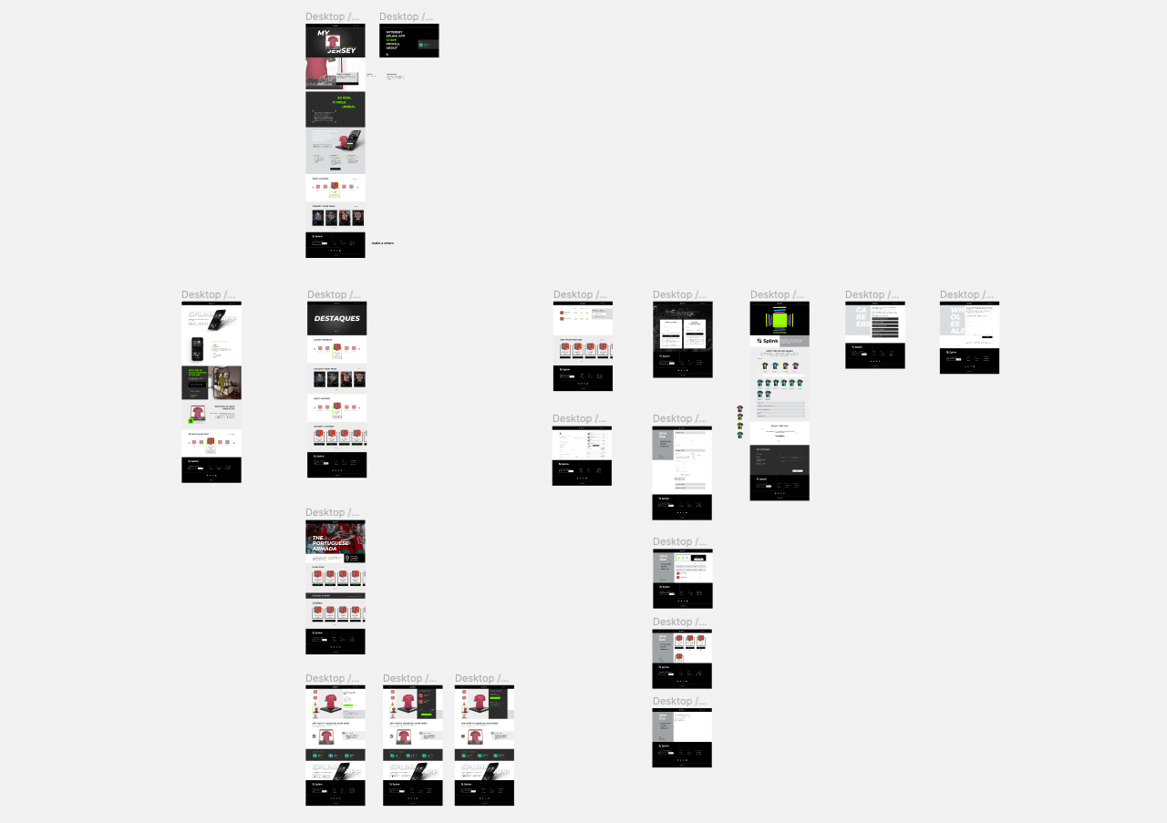
From the concept of sports and club-fan connection, sports+link, SPLINK was born:
(Animation created by the amazing 3D Artist Patrícia Lopes)
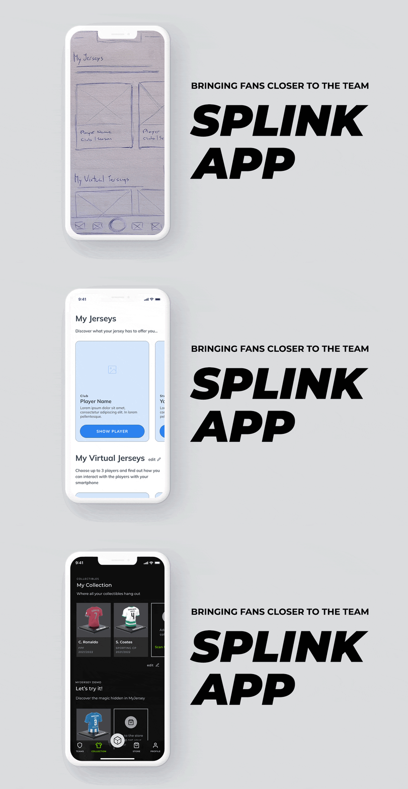
At this point, we had enough information to start working on the new app wireframes. The Splink App gives the user the opportunity to visit the stadium of his club through his smartphone, from the dressing room to the pitch. It is also possible to interact with a 3d model of your favourite player. In addition to the AR experiences, the app is full of team information and statistics and the user can also win prizes by interacting with the app.
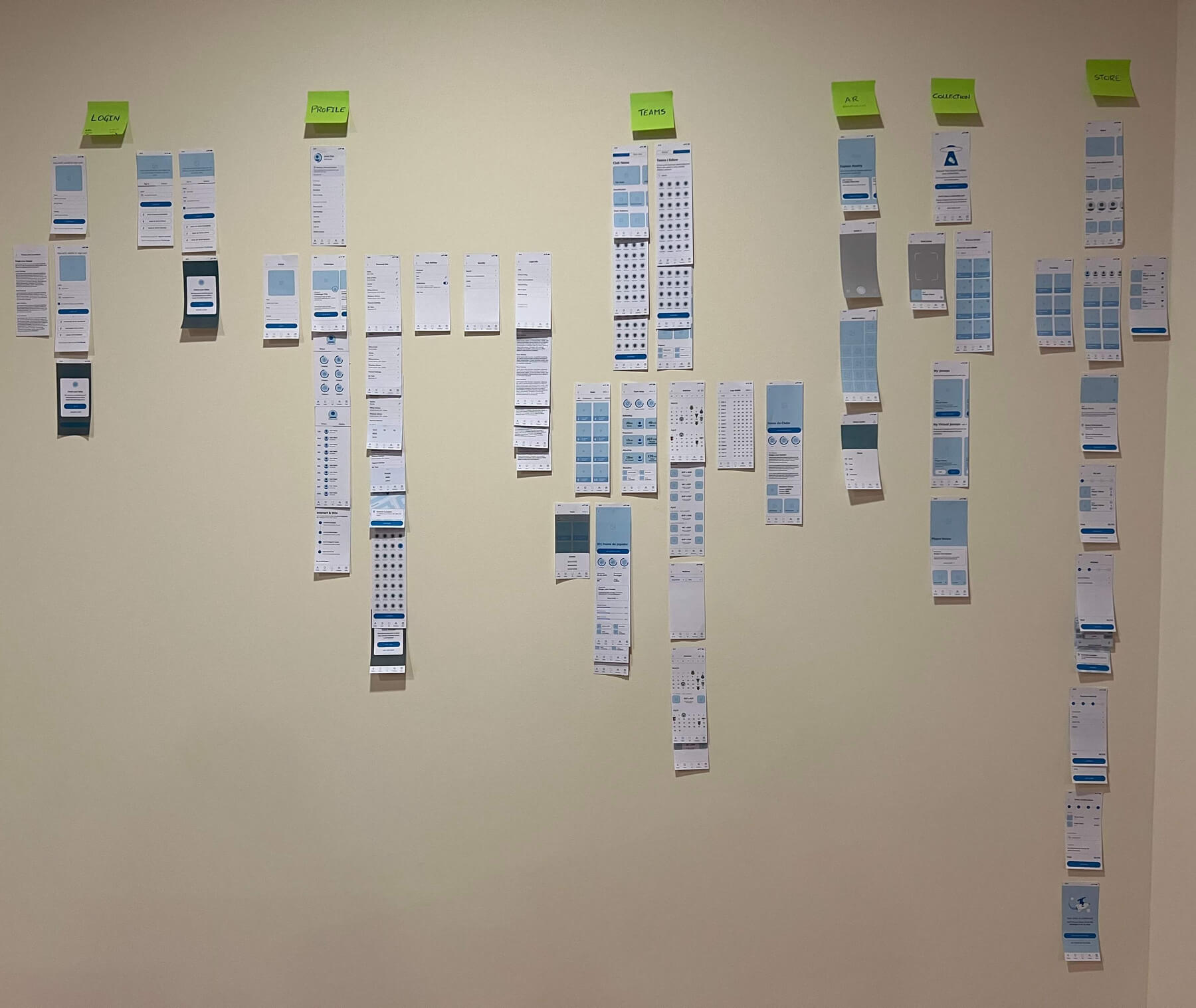
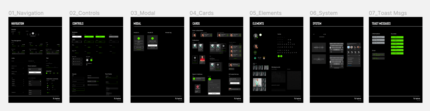
Once the wireframes and the first protoype was settled, it was time to define some styling and figma components, in order to create the first version of the SPLINK Design System.
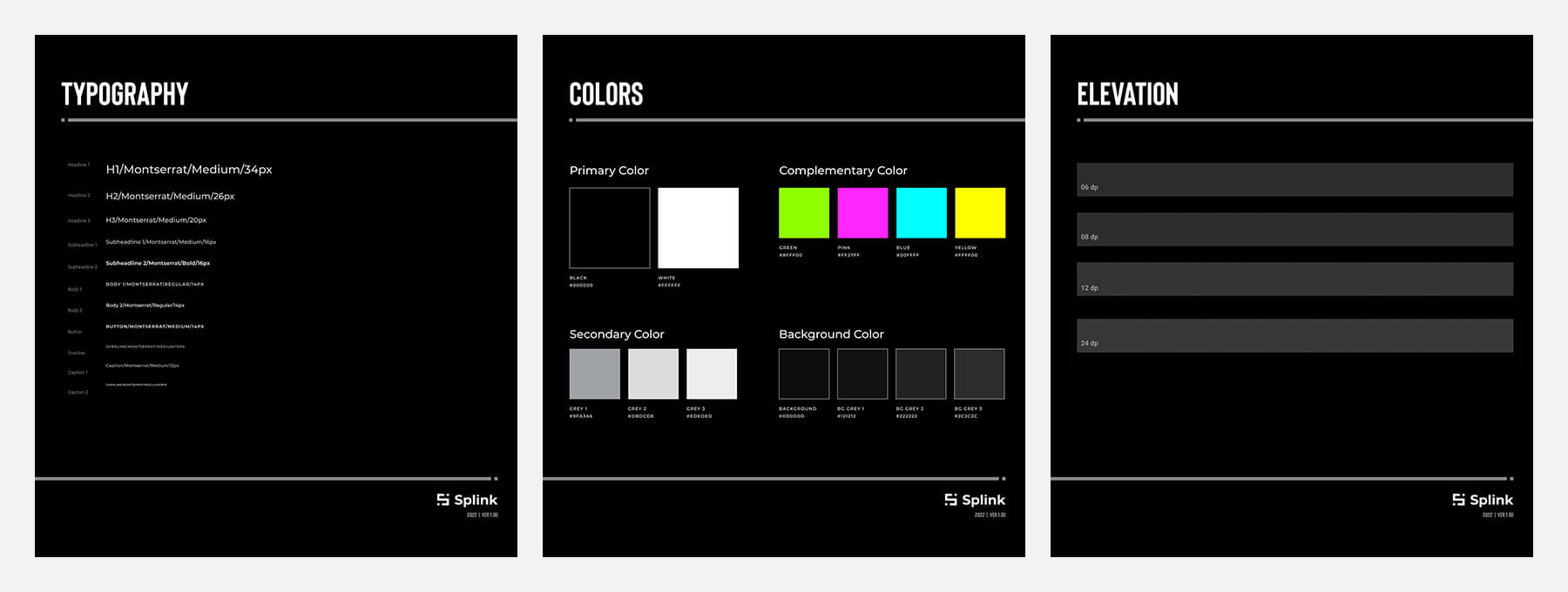
I created the mockups and made a new prototype to make some user testing before passing all the data to the programmers.
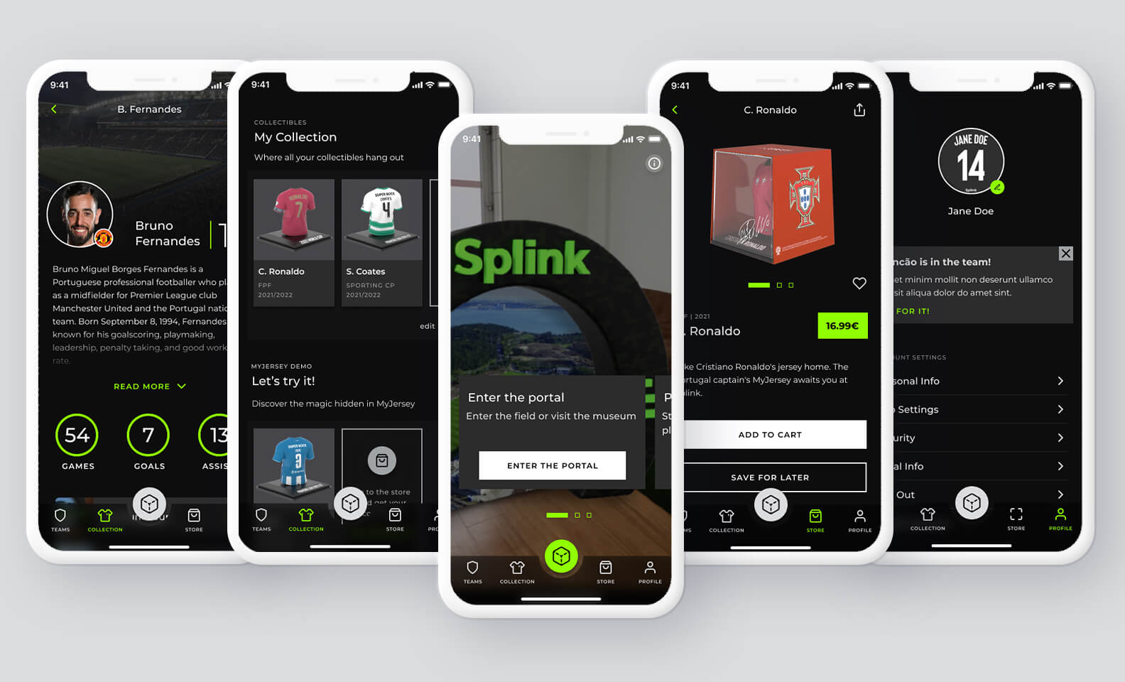
There are still some functionalities in development but the app is already available for download in the App Store and Google Play Store.
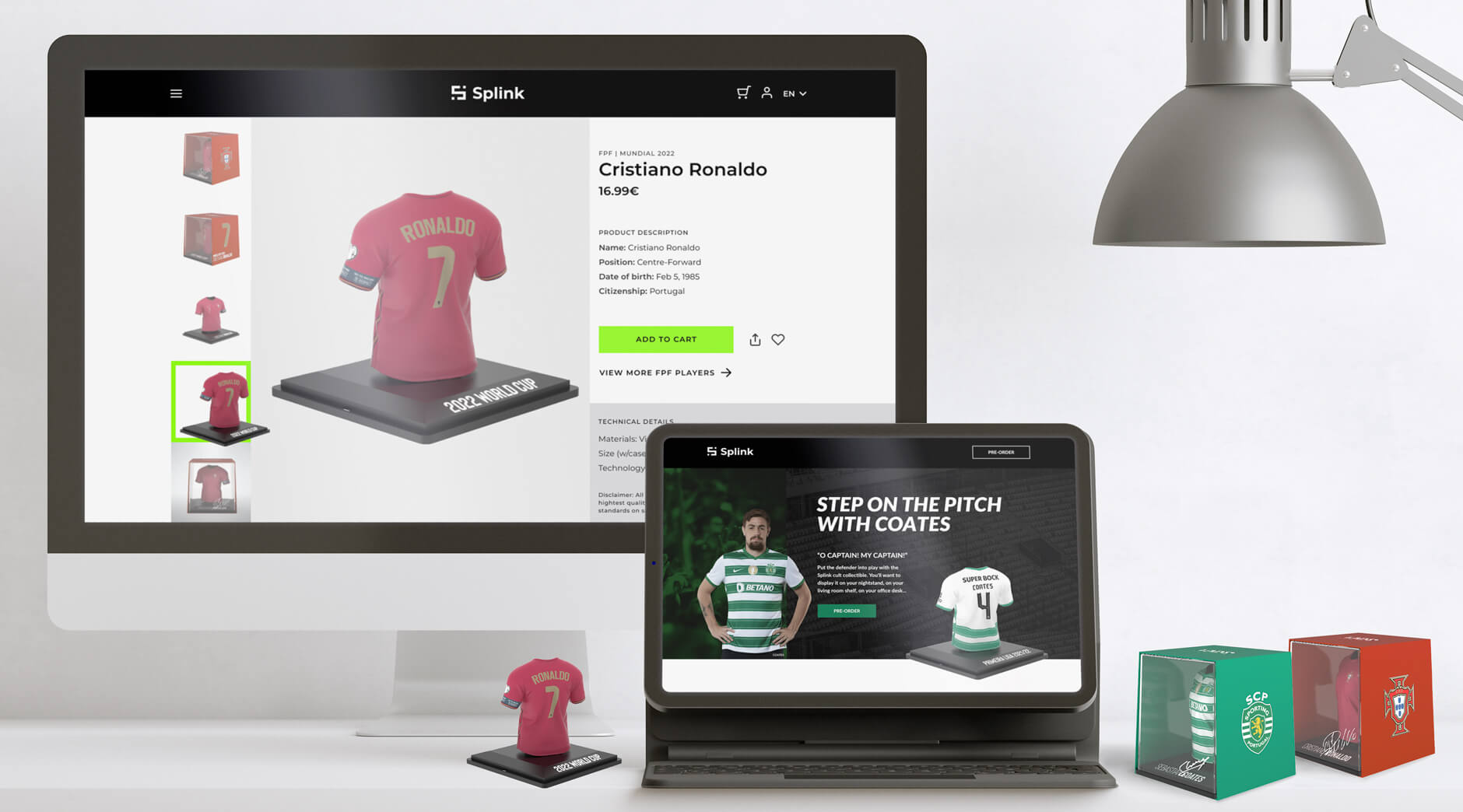
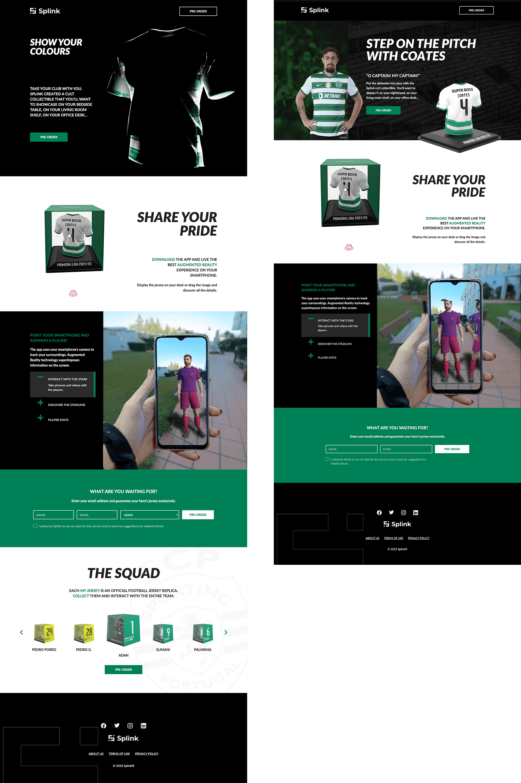
MyJersey was on its way to our warehouse and it was time to make some buzz on social media and generate some leads. The Marketing Team created ads to be presented to users who searched for sports, specific teams and players, football and collectibles. I designed 2 landing pages:
- one with team products
- and the second with a team player highlighted.
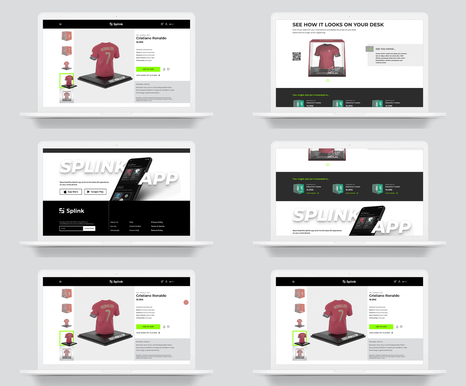
And last but not least, the new website (is under development, so it's not online yet). Besides presenting the product and explaining how the AR works, it should also work as a sales channel.
(Animation created by the amazing 3D Artist Patrícia Lopes)
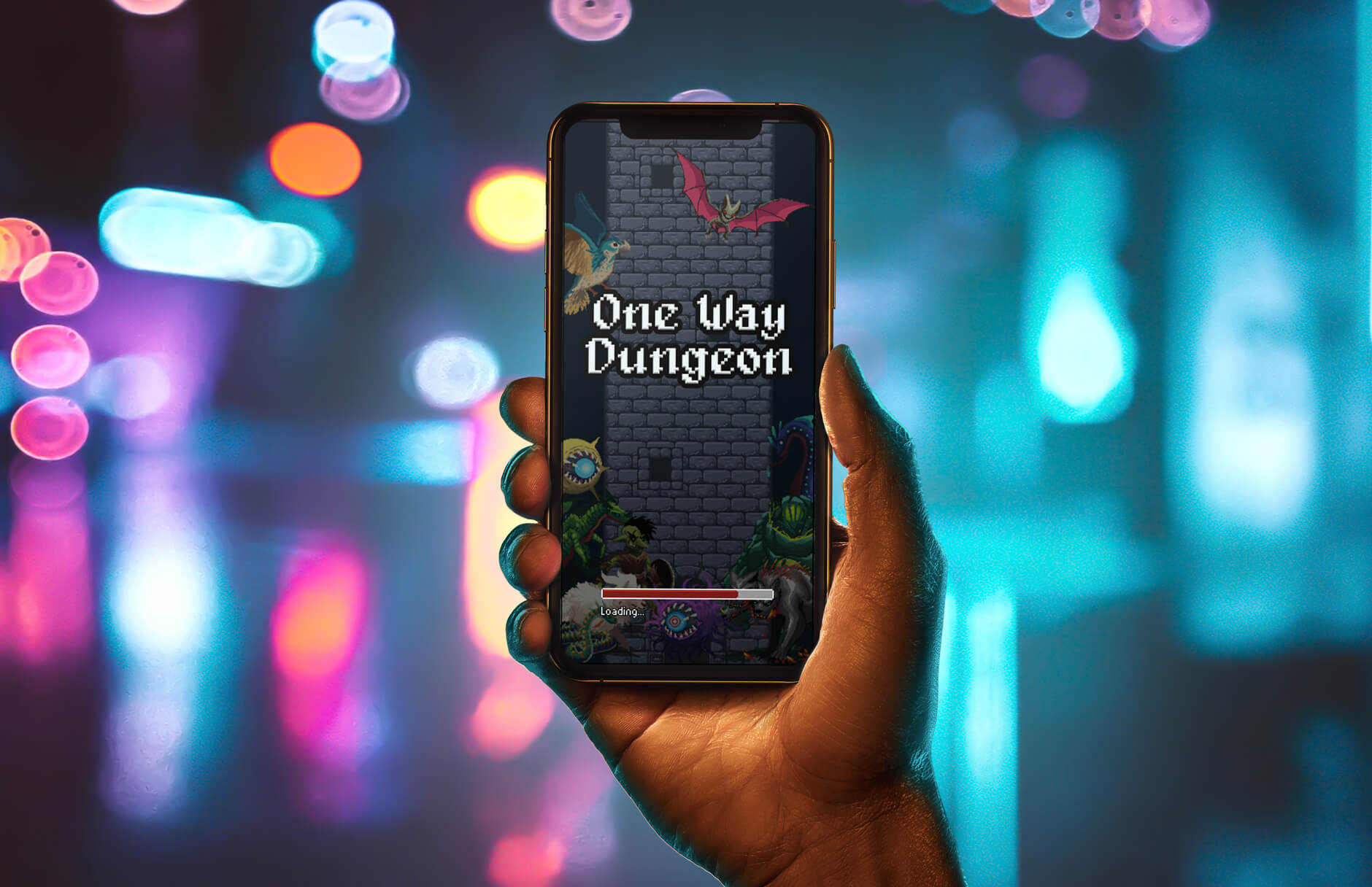
Vasco Correia is a Lisbon based well-succeeded programmer who decided to take a pause in his career and develop an RPG game. He adopted the Vaskivo Dev pseudonym and came to me asking for help with his game's UX but I ended up also working on the UI and designing some art.
He handed me a kind of MVP, with a playable prototype that allowed me to better understand the philosophy and goals of the game.
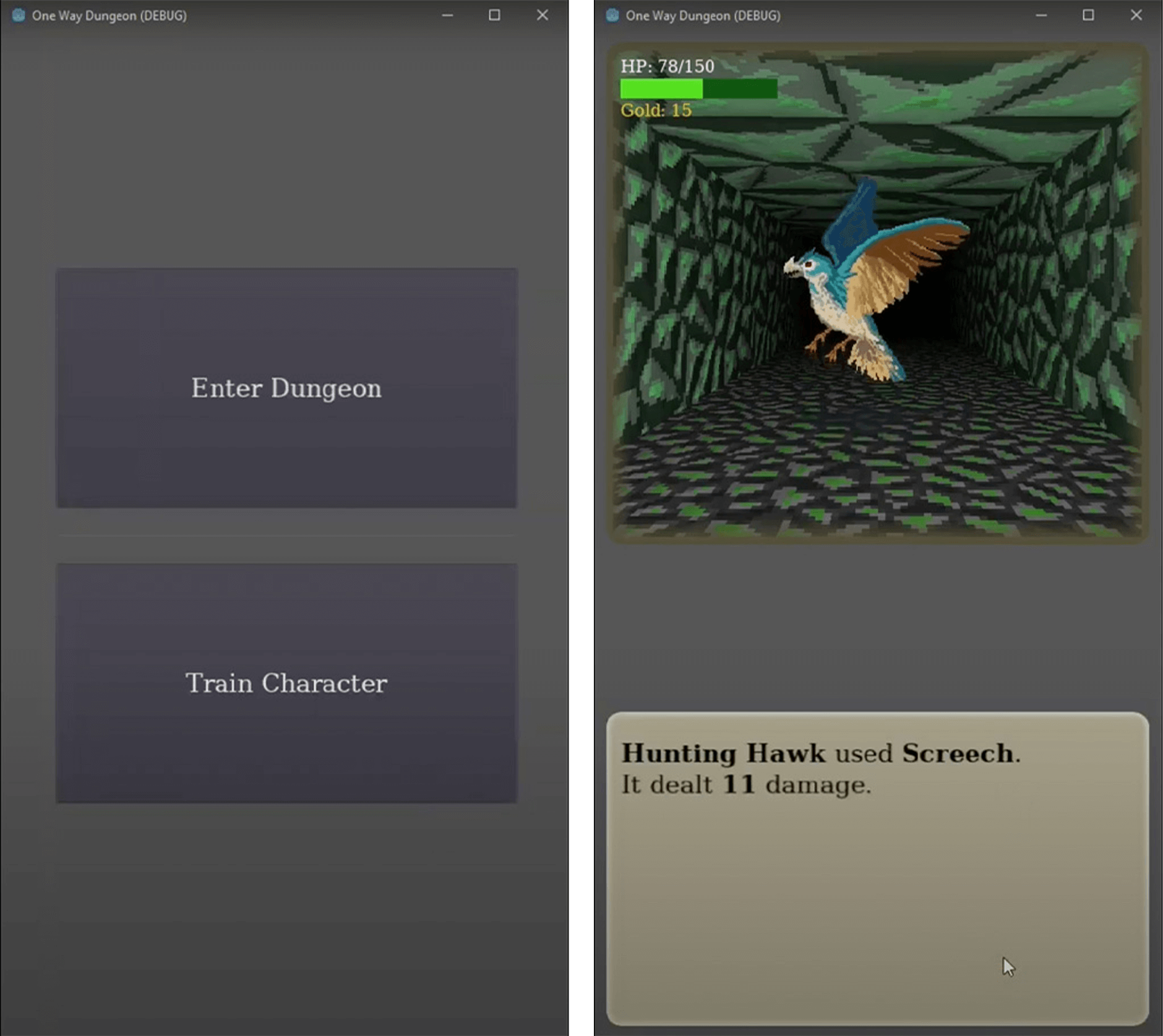
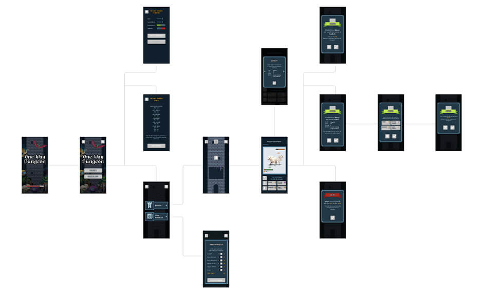
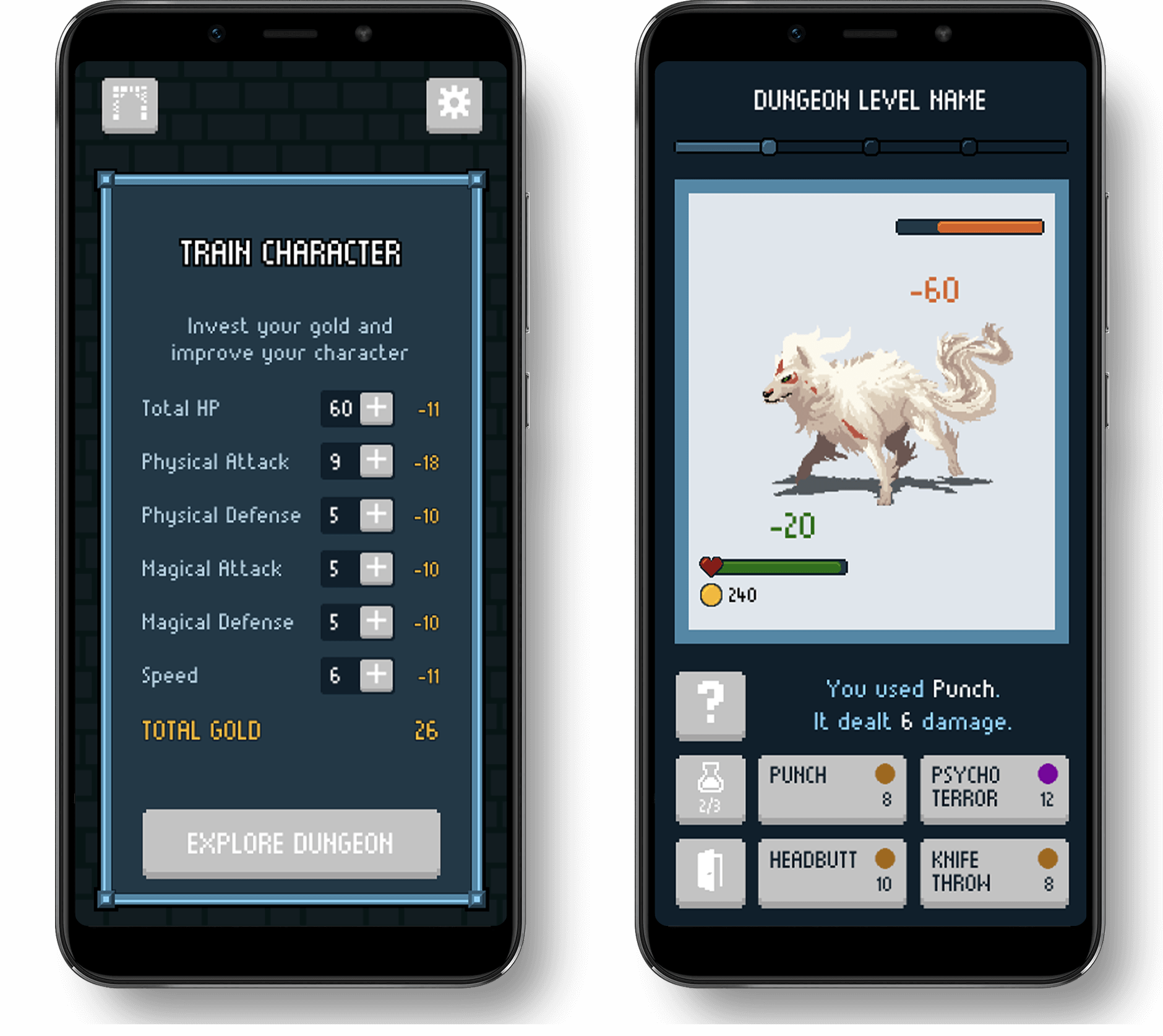
The RPG game designed to be played on mobile devices (portrait view), with a touch interface. From here, the adventure begins:
"Venture into the mystical Flowing Tower and discover its treasures. Defeat monsters turning their abilities against them."
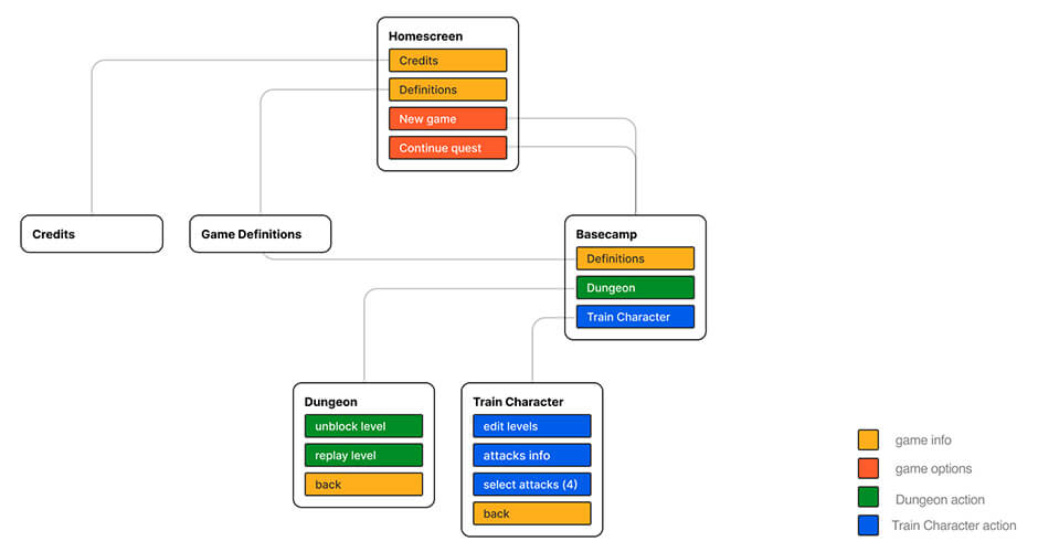
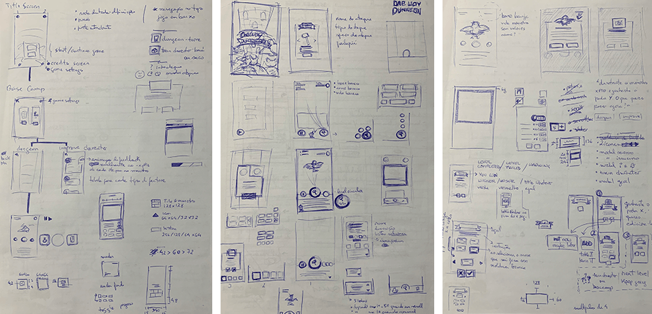
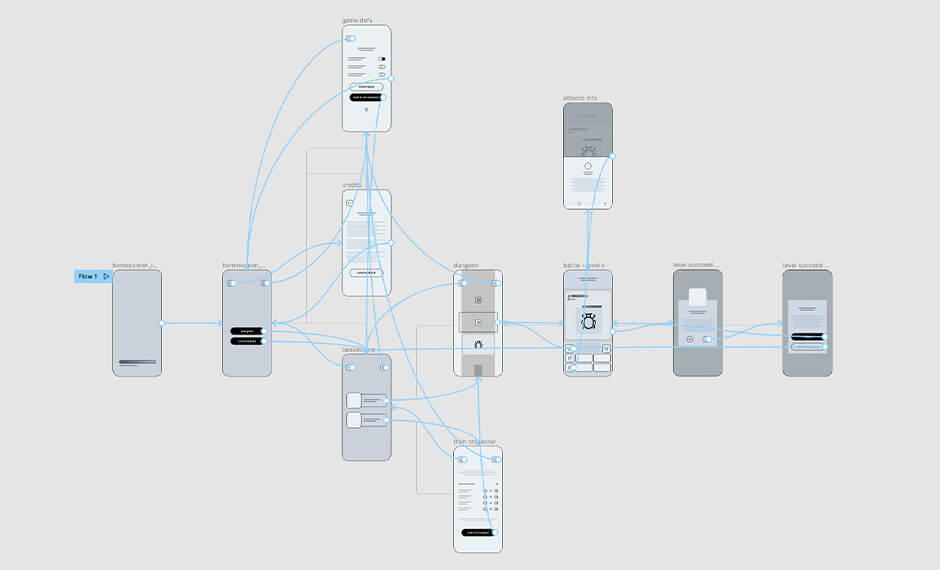
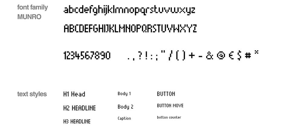
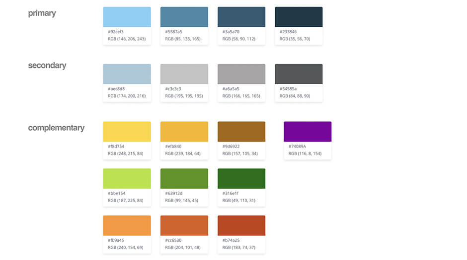
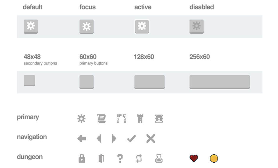
Fantasy, epic, battle, dark, fun and arcade retro are the keywords that define One Way Dungeon

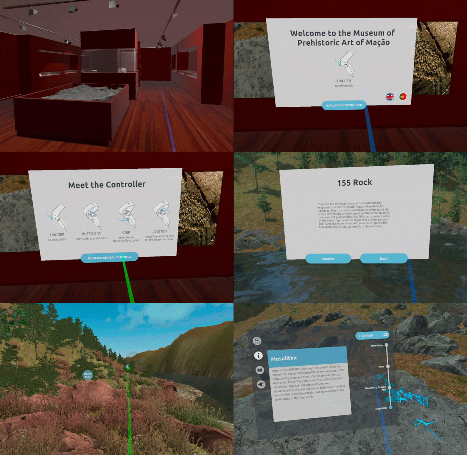
Museum of Prehistoric and Sacred Art in the Tagus Valley is a museum located in Mação that wanted its visitors to be able to visit the prehistoric art located at Tagus river margins. Due to the dam construction, some pieces were lost and others are located on private property or are inaccessible by foot.
Thus, in order to allow its visitors full access to this historic heritage, the Museum asked Retrai to develop a virtual visit to the site. I've partnered with Retrai in designing the experience, where visitors could view and explore Tagus's engravings and rock art. The application would allow visitors to be in a 3D environment where they could select an area to explore its engravings.
Navigation in the environment is carried out naturally, with the user able to move freely and also through points of interest. The user can select a series of predefined points and be transported to them.
The engravings are divided both by chronological line and by typology.
The application allows the visualization of the evolutionary line and to filter/highlight a certain typology.
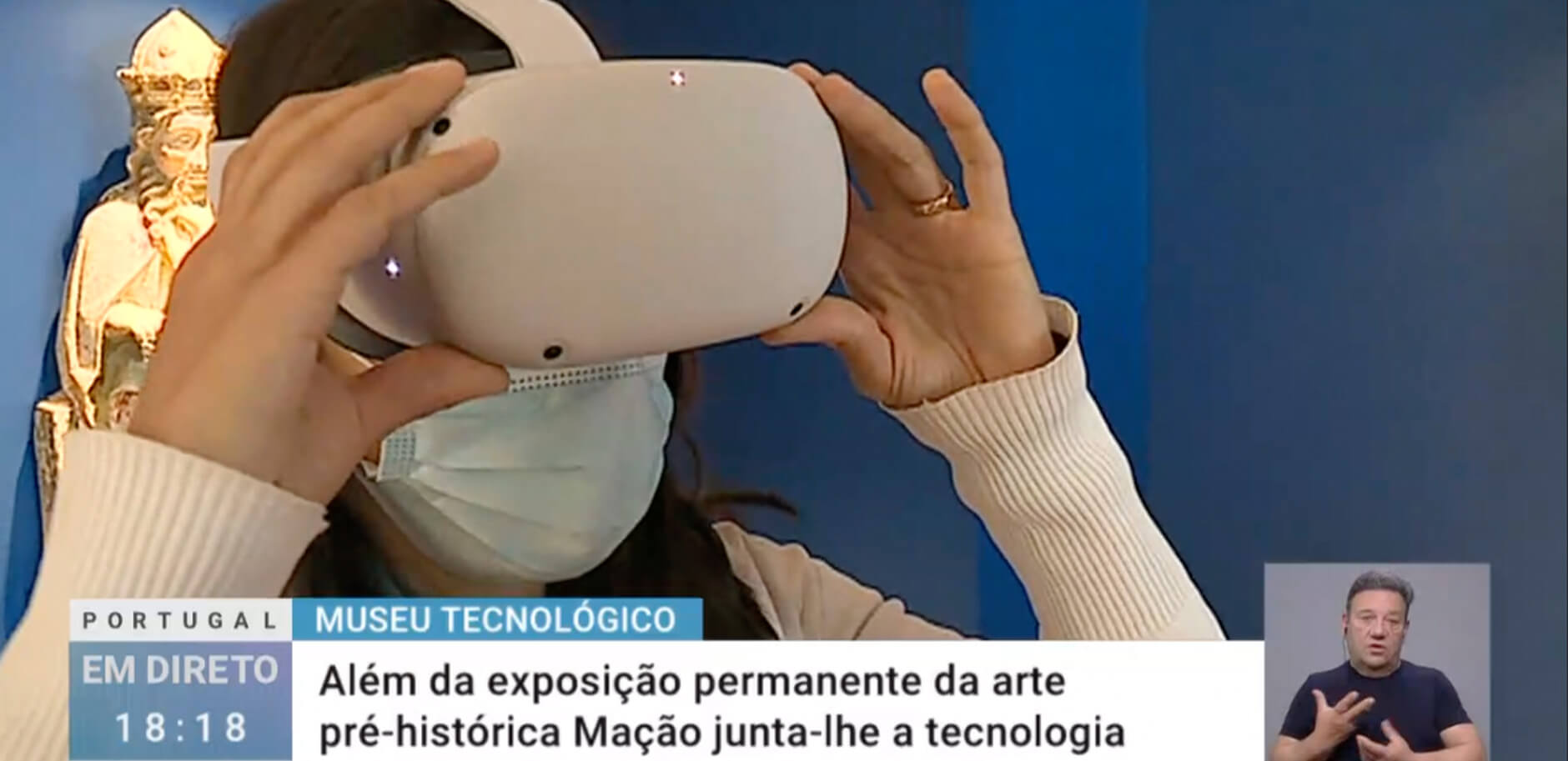
RTP (Portugal's public tv channel) made a piece about the museum's technological approach where they talk about this project. Watch it here, from 19:24 onwards.
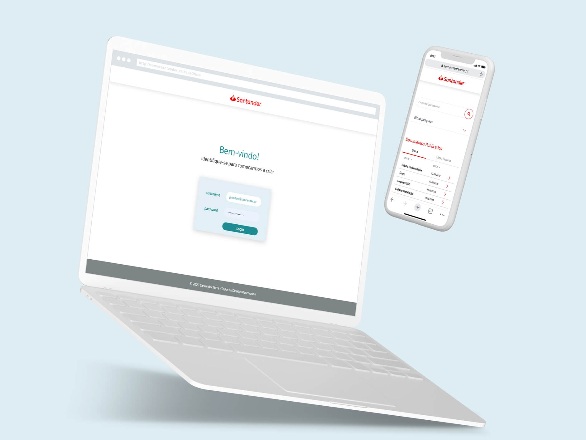
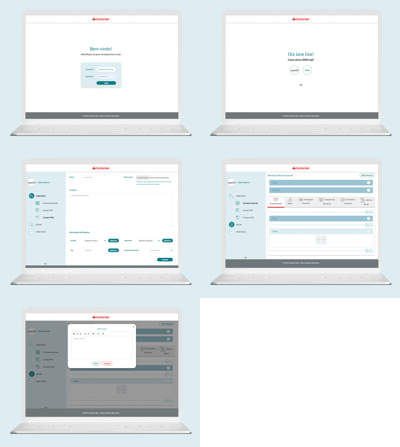
Santander regularly sents info to its workers, as a digital newspaper, regarding commercial info about its services or products. This happens at least once a day.
In order to facilitate the access to specific info from the bankers, I was asked to design a solution that made this search easier.
Besides witnessing the process of communication between central services and the balcony, I heard the frustrations and goals of the team responsible for the journals, and with Retrai as a partner, we went for more than a searching tool.
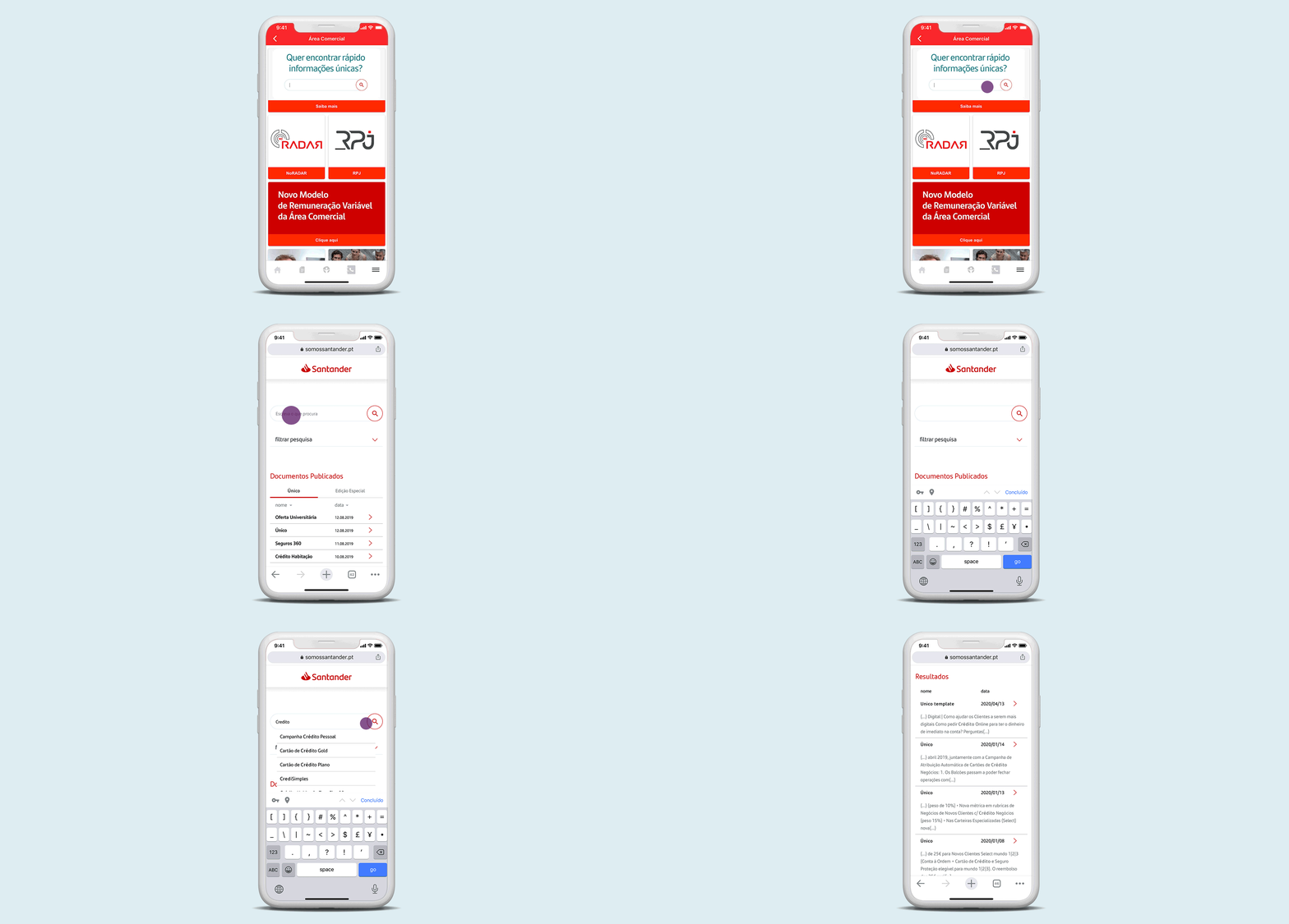
Santander has an app called Somos Santander App, a place where the bank reunites all the info that is useful to its workers, from information about products or sales to the advantages of being a Santander's worker. So, regarding the security issues and the utility of this app, it made sense to embed the searching tool in the app.
After clicking on the banner, the user is able to search for a keyword and be served with all the documents that contain info about or related to it. While writing, the user is presented with similar suggestions.
We developed a BackOffice where it was possible to upload pdf documents and having its data searchable.
It was also possible to create the entire document in here, releasing the team from having to design the documents in InDesign and then upload a pdf and send it by email. The user could just start from a blank page or select a template and edit from there.
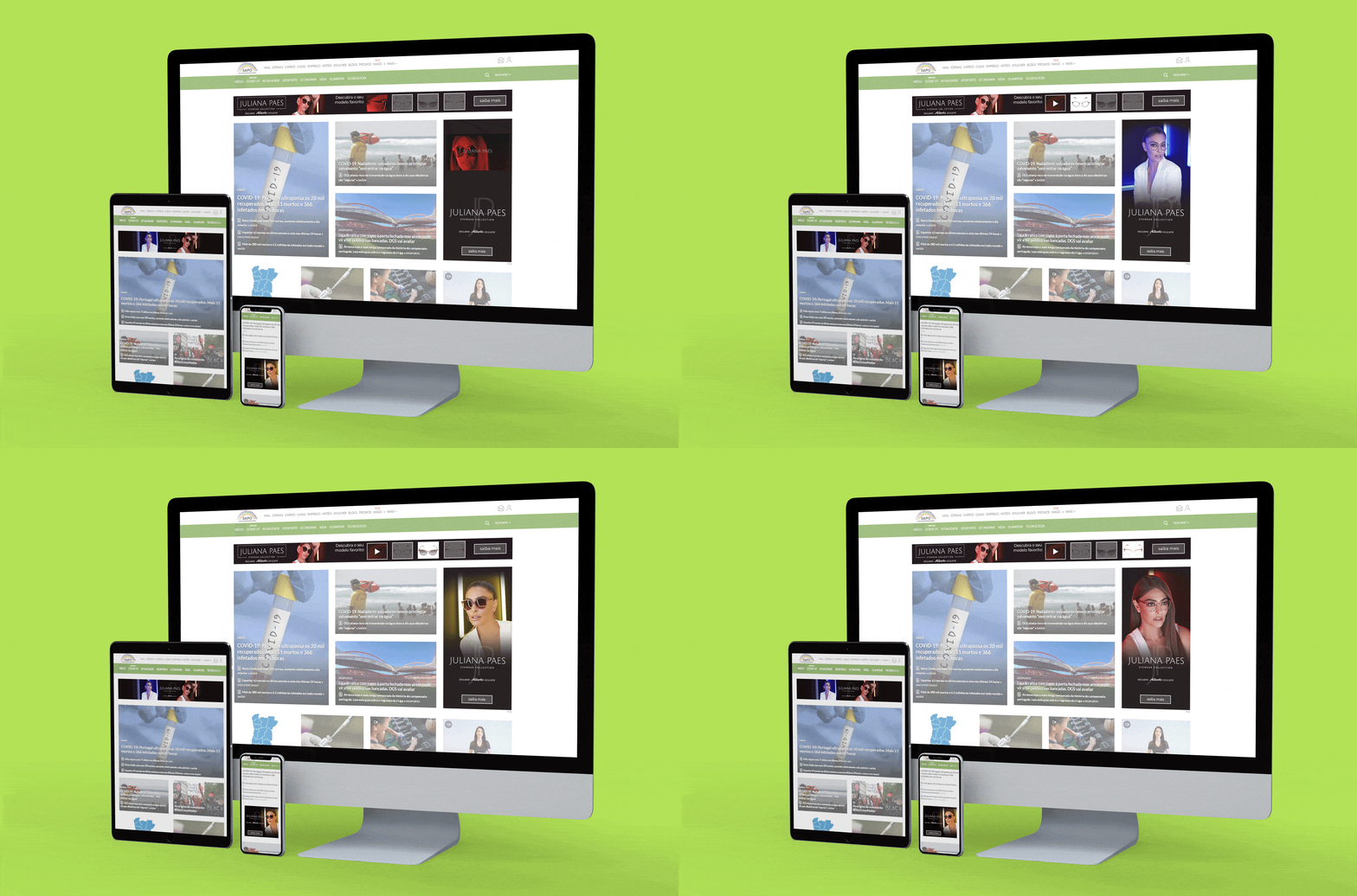
At SAPO I work mainly with advertising formats. From banners to campaign landing pages or newsletters, I design and/or develop different solutions.
The campaign above was designed for Alberto Oculista and I developed several formats: Quality View (click to see it working), Billboard and MREC.
Some formats, like Quality View, demand us to design it in Photoshop or Illustrator first and then make it all work through html, css and javascript.
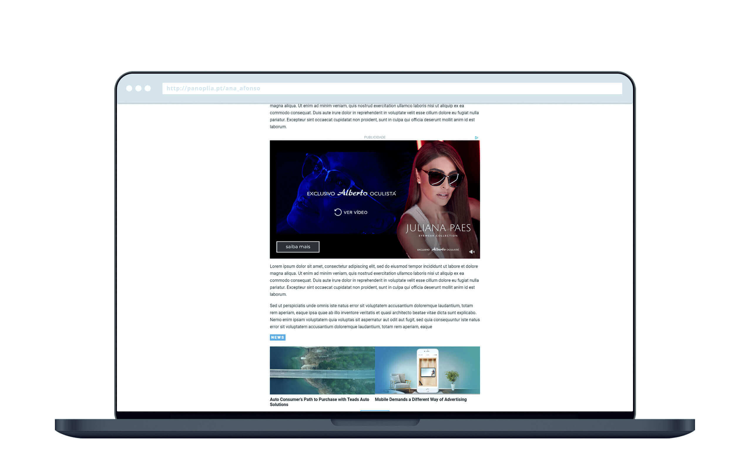
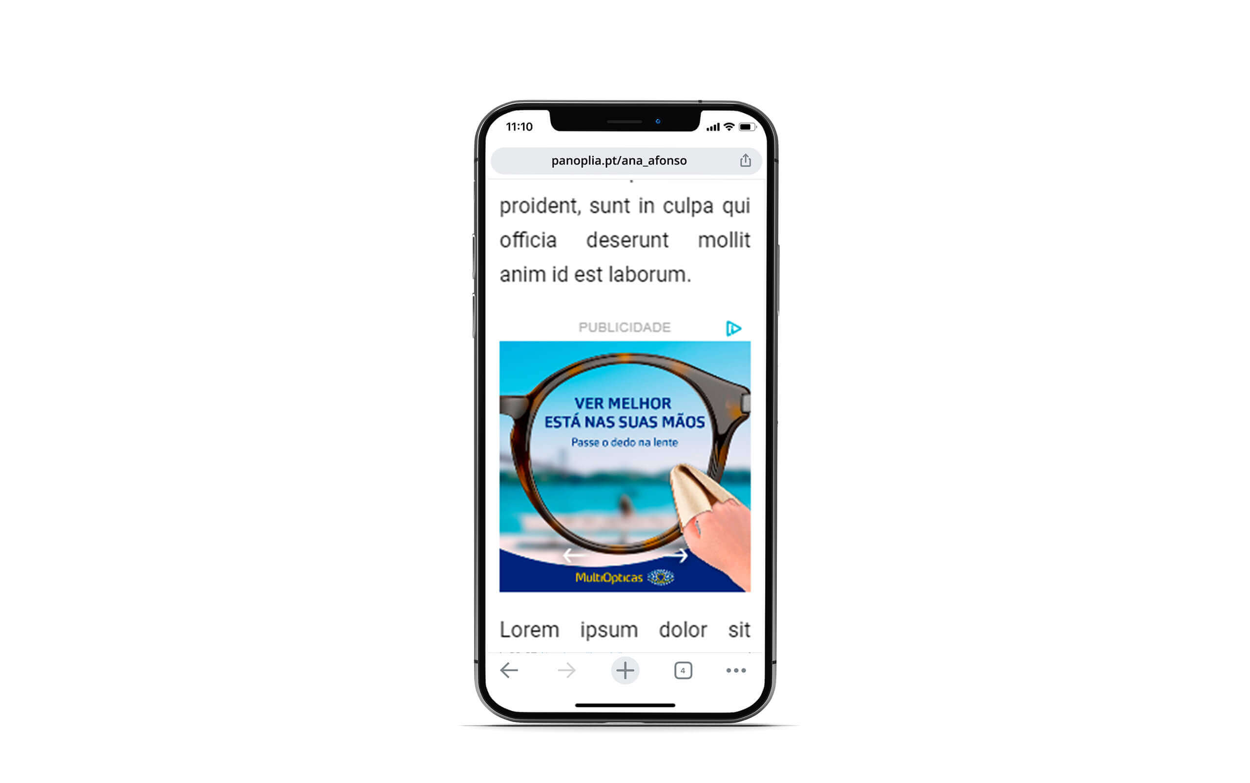
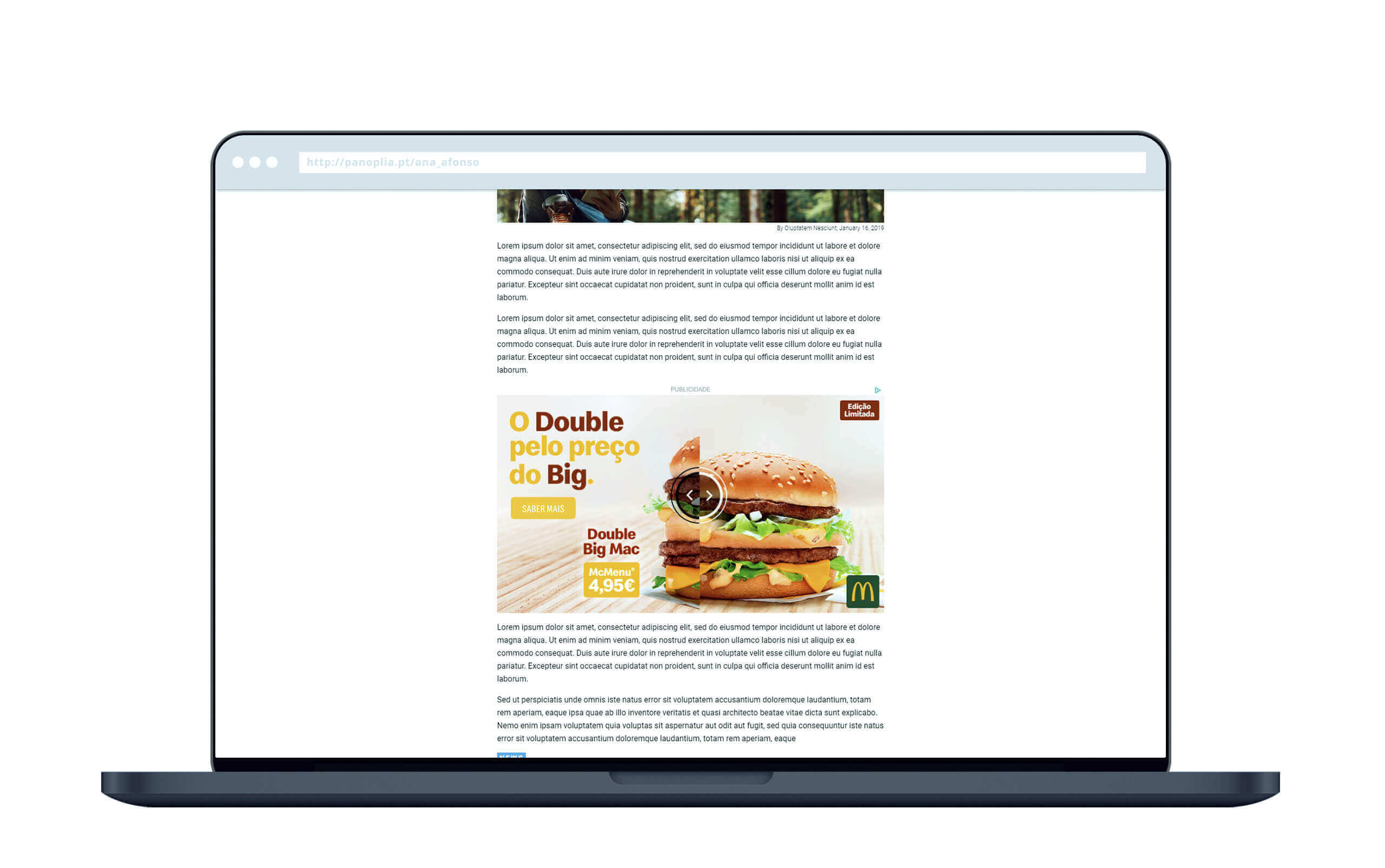
We also work with Teads, a SAS platform with predefined templates that we can edit or derive from. Click on the images above to see the campaigns made for Alberto Oculista, MultiOpticas and McDonalds working.
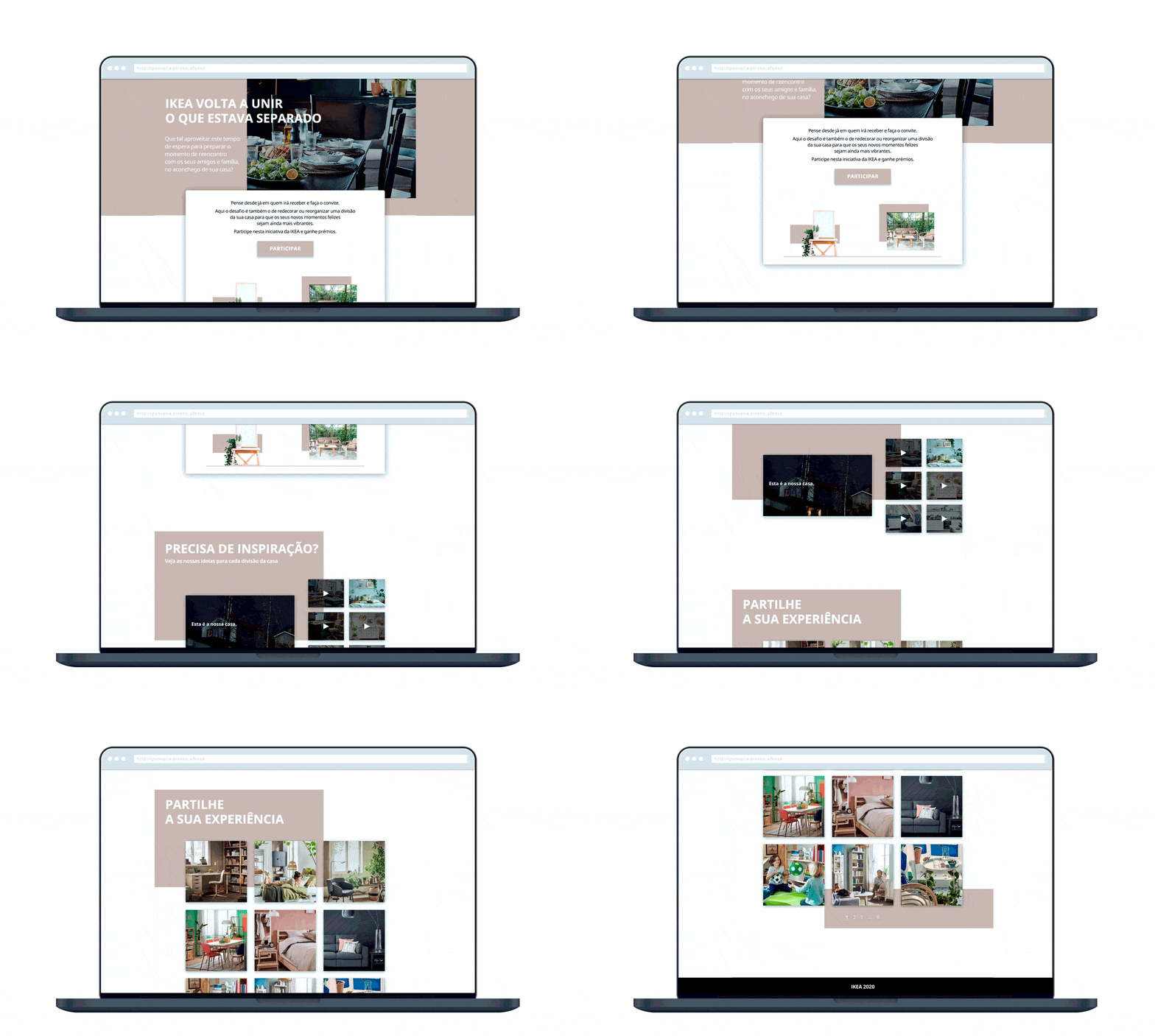
Below you'll find a proposal for IKEA. With the pandemic, the physical stores were obliged to close, reinforcing the e-commerce paper.
Under the concept "celebrate happy moments", I designed this landing page which included a Qualifio interactive form and a social media integration to reinforce engagement.
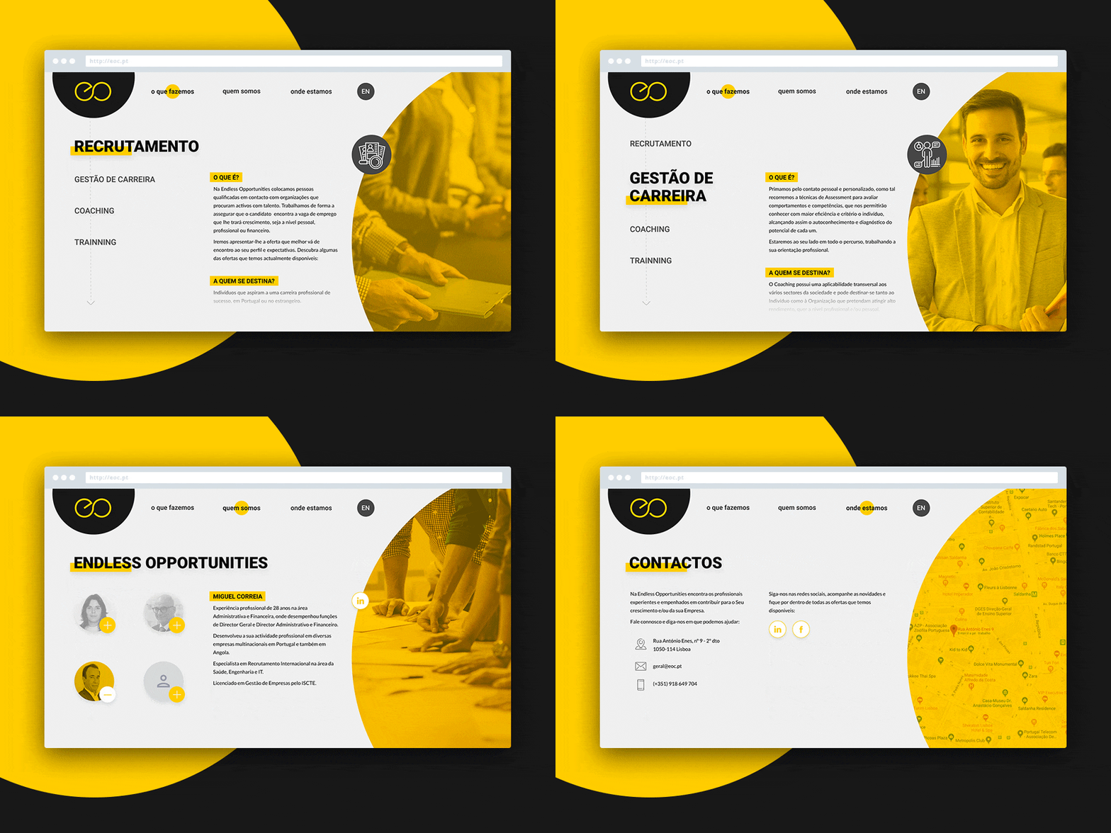
Identity design for the Consultant Endless Oportunities, with experience in consulting and management oriented towards personal and organizational development, behavioral and technical skills, which promote excellence and success in the overall performance of the individual and the companies.
The right person in the right place. The claim of an effective contribution to self-knowledge and the promotion of success in the performance of each and every one. Endless Opportunities focuses on the individual, on their unique skills and potential, across 3 areas of expertise: Consulting, International Recruitment and Real Estate.
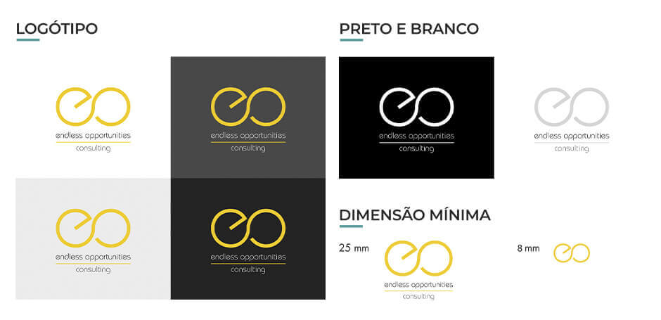
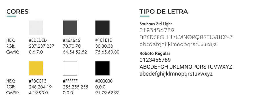
The initials of the name form a symbol of infinity, alluding to endless opportunities. These are based on a solid base (allowed for Endless Opportunities, either by training or by providing suitable job offers to the individual) represented by the stylus. The lettering is clean for a clear and objective perception, still ensuring a modern look & feel. The color adopted was yellow, seeking to refer to an environment of happiness and optimism, warmth and comfort provided by Endless Opportunities.
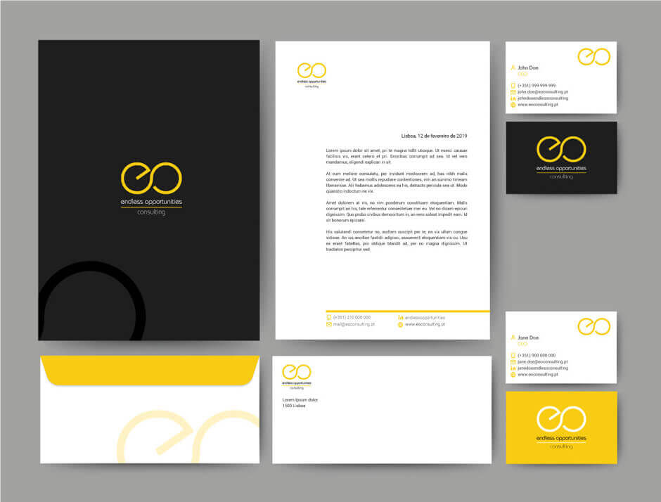
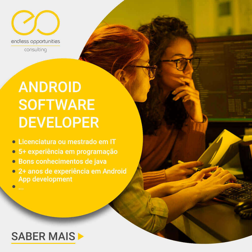
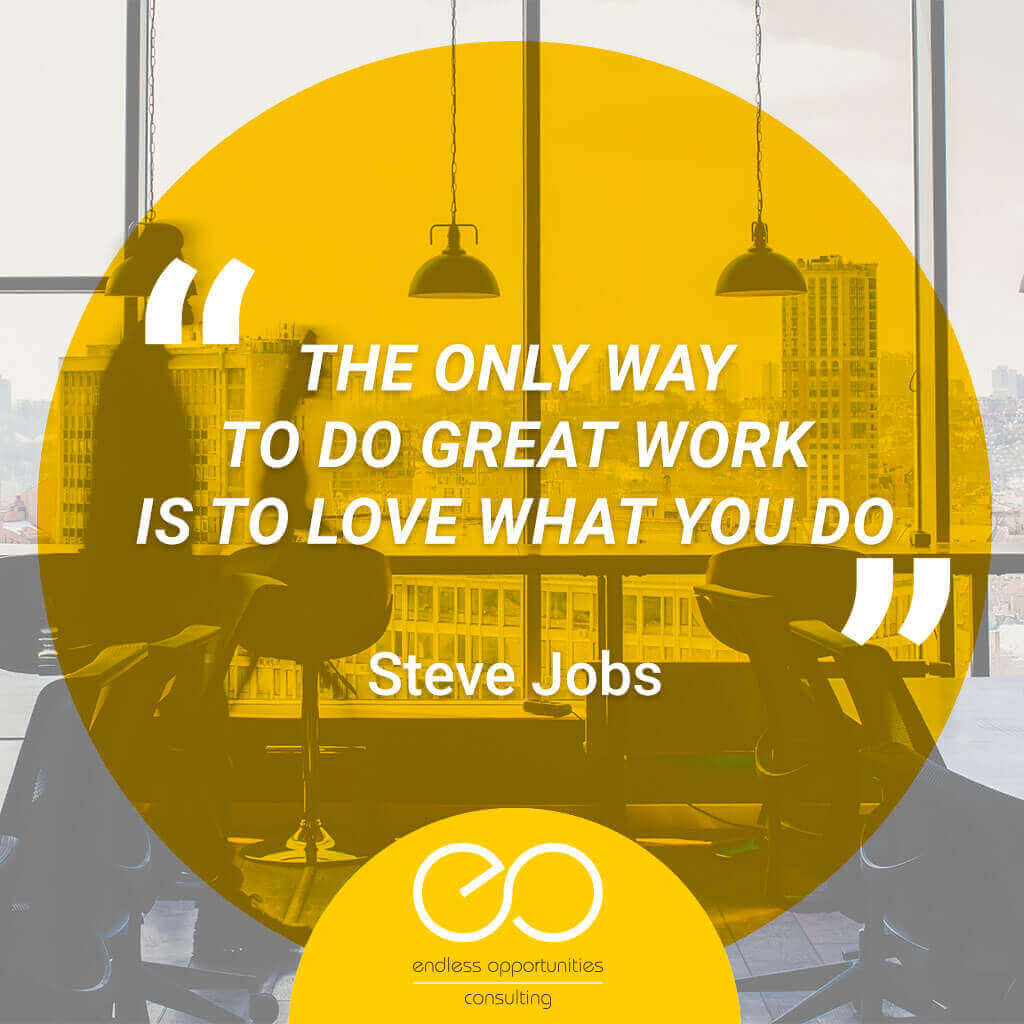
In addition to the stationary, the social networks (Linkedin and Facebook) were set up and a post template was created for their autonomous dynamization.
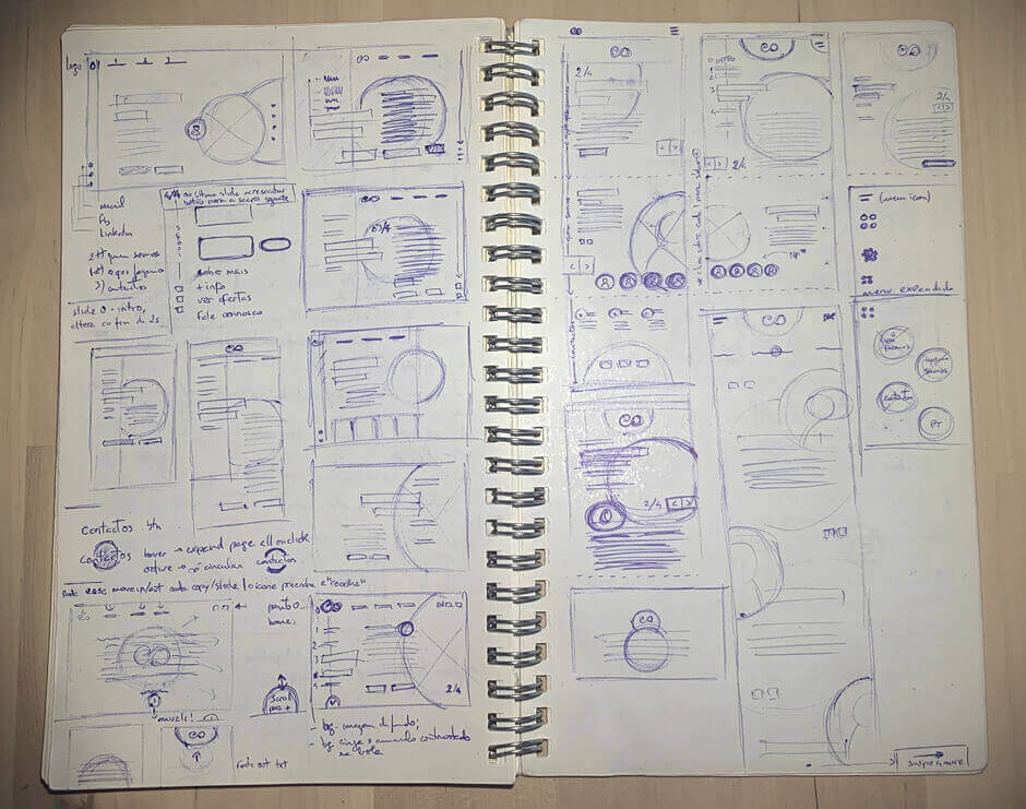
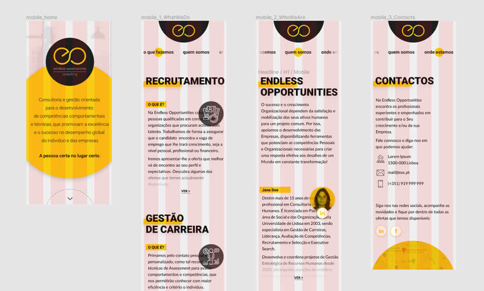
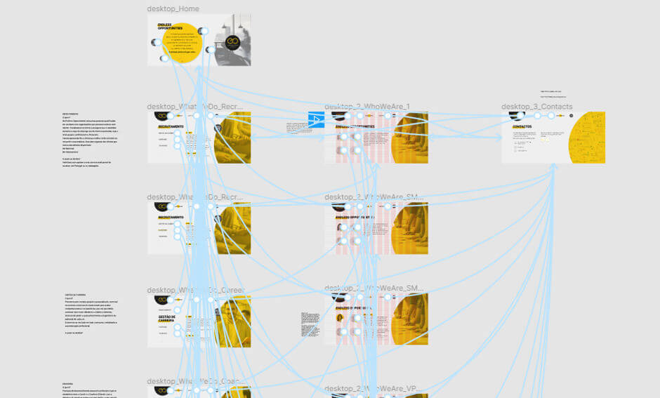
For the website, I started drawing the wireframes on paper and then designed the mockups, UI kit and the prototype on Figma.

Rute Medo | Santander
Director of Communication and Commercial Promotion
Pedro Moura | Retrai
Co-Founder & Interactive Developer
Bruno Saraiva | GroupM
Digital Marketing Consultant
Got a project? Let's talk! Just drop me a line here.
Want to see more work or learn about my process? Save yourself the guessing and reach me out:
